Exploratory data analysis
- bring in data from the web:
- check missing values and drop them:
- find unique values in 'num-of-cylinders' column:
- changing letters to numbers in the 'num-of-cylinders' column:
- create a boxplot for the variable "engine-size" with the x-axis as "number of cylinders":
- create a scatterplot for the variable "price" with the x-axis as "engine-size":
- group "drive-wheels" and "body-style" and find the average price for each group:
- # group "drive-wheels" and "body-style" and find the average price for each group in a pivot table:
- create a heatmap for the pivot table:
- filter correlations < -0.7 or > 0.7 from df:
- correlation between 'engine-size' and 'price':
- weak correlation
- correlation values of the three attributes with Price
import pandas as pd
import numpy as np
import matplotlib.pyplot as plt
import seaborn as sns
from scipy import stats

# import data from the web and store it in a pandas dataframe
url = 'https://cf-courses-data.s3.us.cloud-object-storage.appdomain.cloud/IBMDeveloperSkillsNetwork-DA0101EN-SkillsNetwork/labs/Data%20files/automobileEDA.csv'
df = pd.read_csv(url)# replace "?" to NaN
df.replace("?", np.nan, inplace = True)
# show columns with counts of missing data
missing_counts = df.isna().sum() # same as df.isnull().sum()
missing_counts[missing_counts > 0]
# drop all missing values
df.dropna(axis=0, inplace=True)print(df['num-of-cylinders'].unique())['four' 'six' 'five' 'three' 'twelve' 'two' 'eight']
df['num-of-cylinders'] = df['num-of-cylinders'].replace({'two': '2', 'three': '3', 'four': '4', 'five': '5', 'six': '6', 'eight': '8', 'twelve': '12'}).astype(int)# create a boxplot for the variable "engine-size" with the x-axis as "number of cylinders"
fig = plt.figure(figsize=(10, 6))
ax = fig.add_subplot(111)
ax = df.boxplot(column='engine-size', by='num-of-cylinders', ax=ax)
plt.ylabel('Engine Size')
plt.show()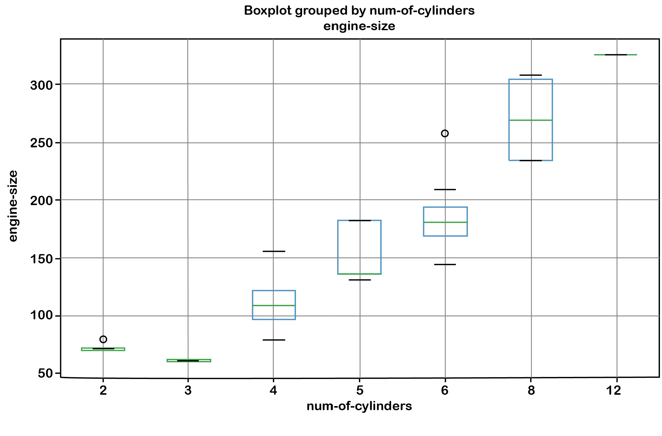
or using 'seaborn':
sns.boxplot(x='num-of-cylinders', y='engine-size', data=df)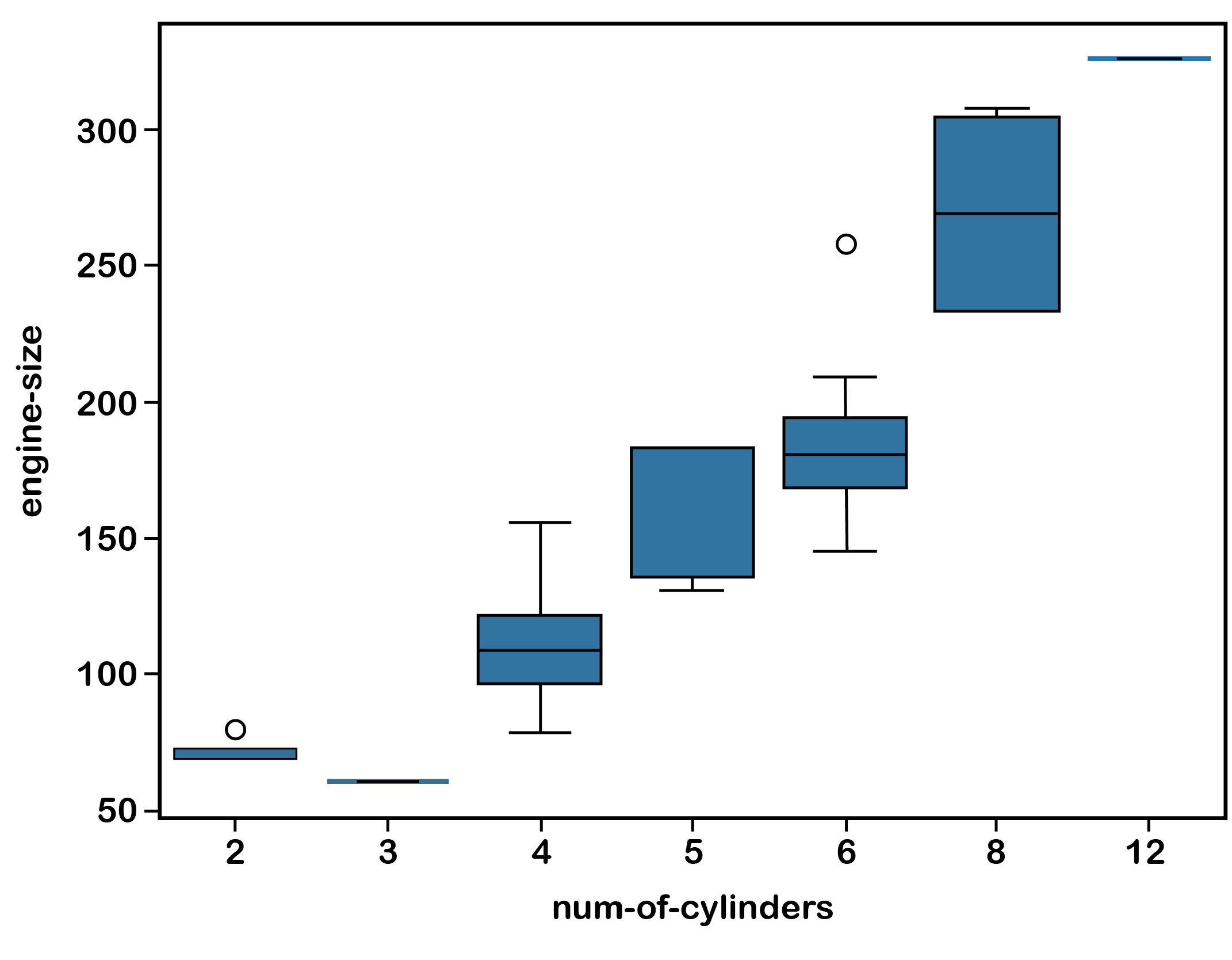
# Create a new figure with dimensions 10 inches by 6 inches for plotting
fig = plt.figure(figsize=(10, 6))

plt.scatter(df['engine-size'], df['price'])
plt.title('Scatter plot of engine size vs price')
plt.xlabel('Engine Size')
plt.ylabel('Price')
plt.show()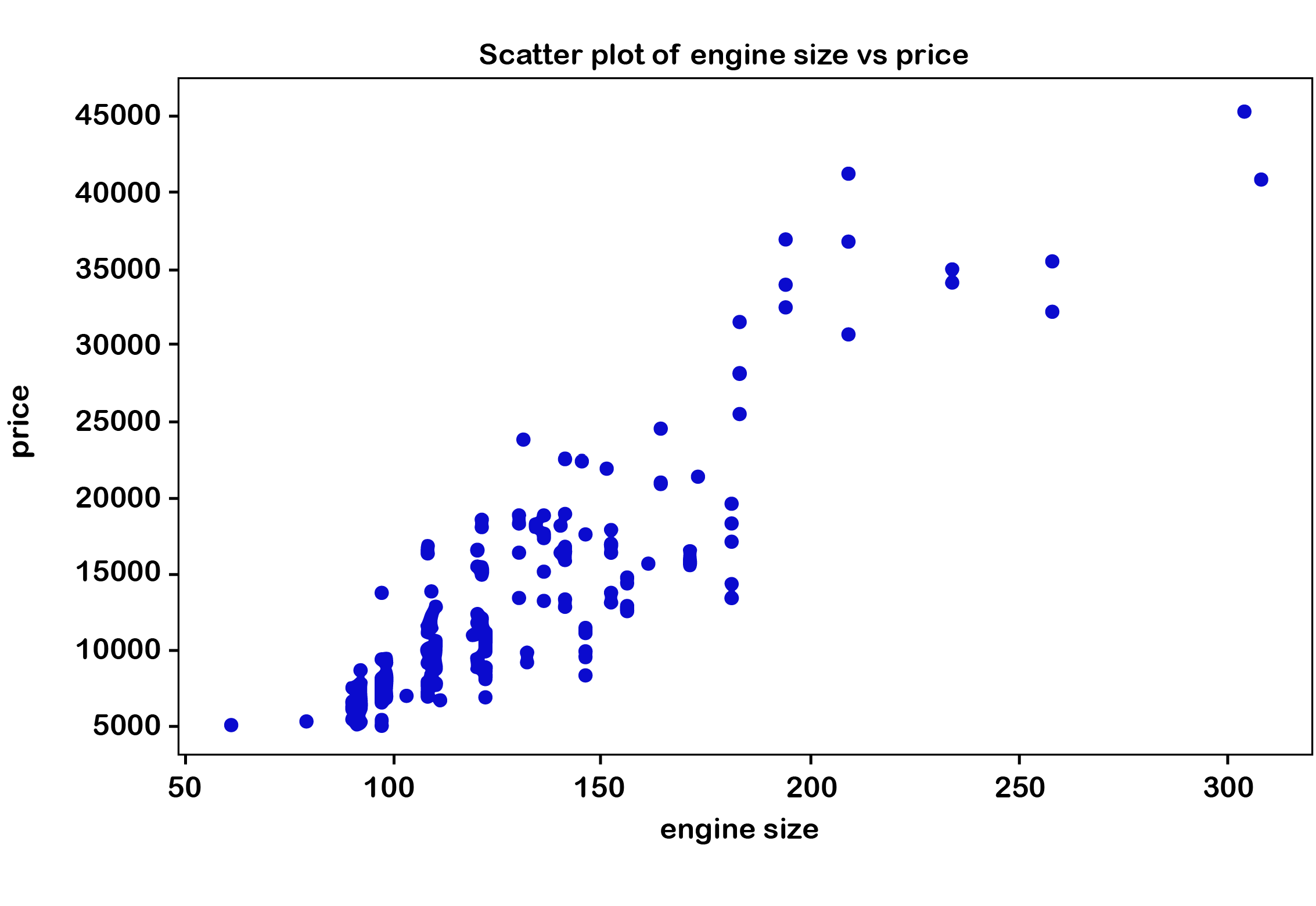
df.groupby(['drive-wheels', 'body-style'])['price'].mean()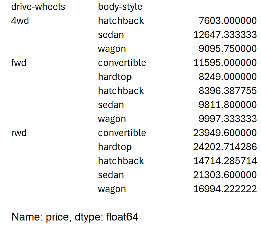
To reset the index and have a flat dataframe, use the reset_index function:
grouped_df = grouped_df.reset_index()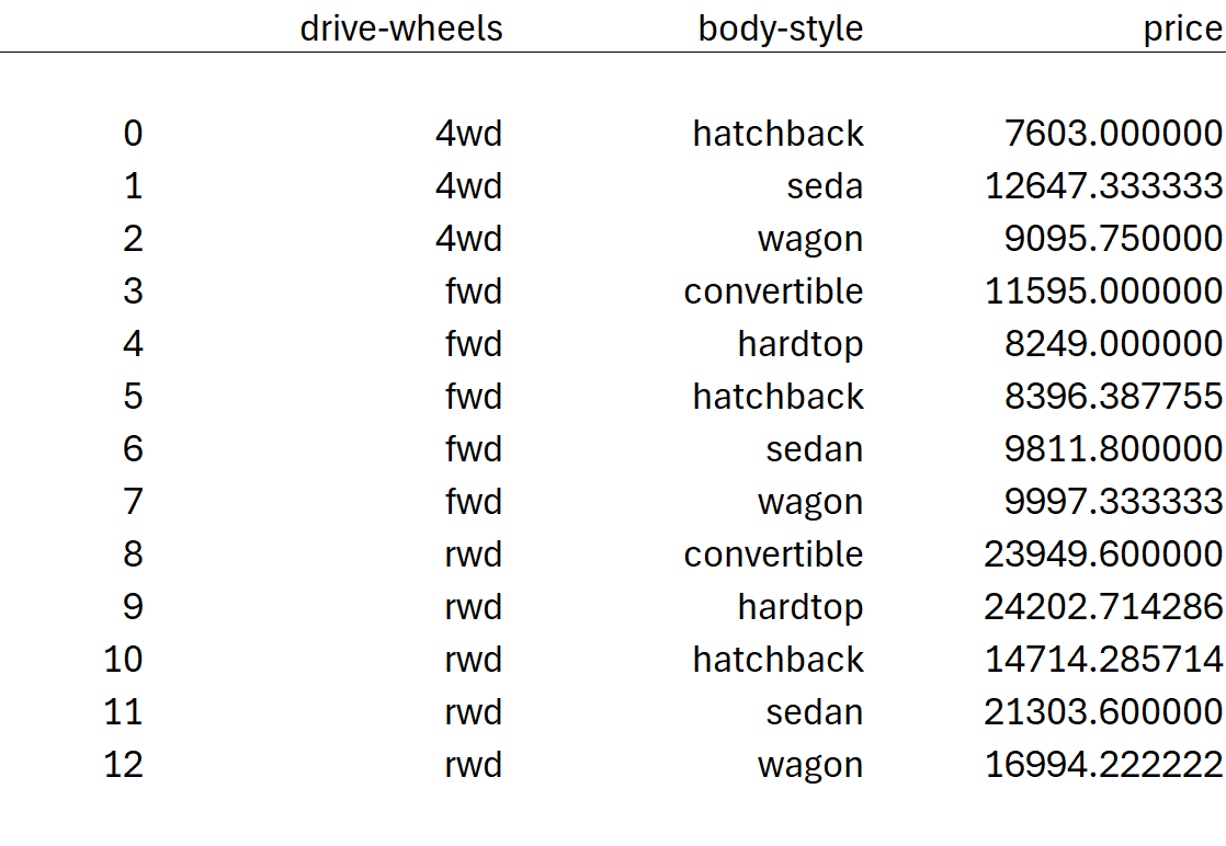
grouped_pivot = pd.pivot_table(df, values='price', index='drive-wheels', columns='body-style', aggfunc='mean', fill_value=0).astype(int)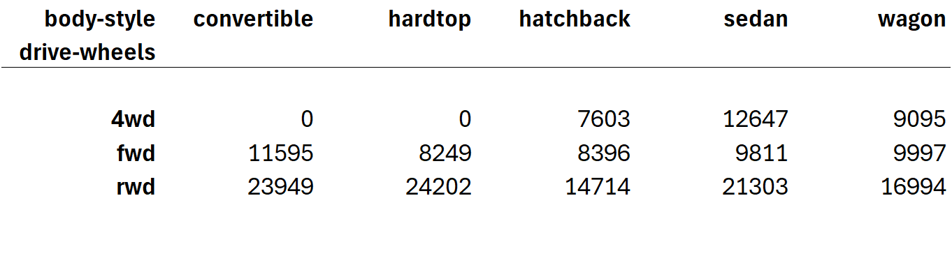
plt.pcolor(grouped_pivot, cmap='RdBu')
plt.colorbar()
plt.show()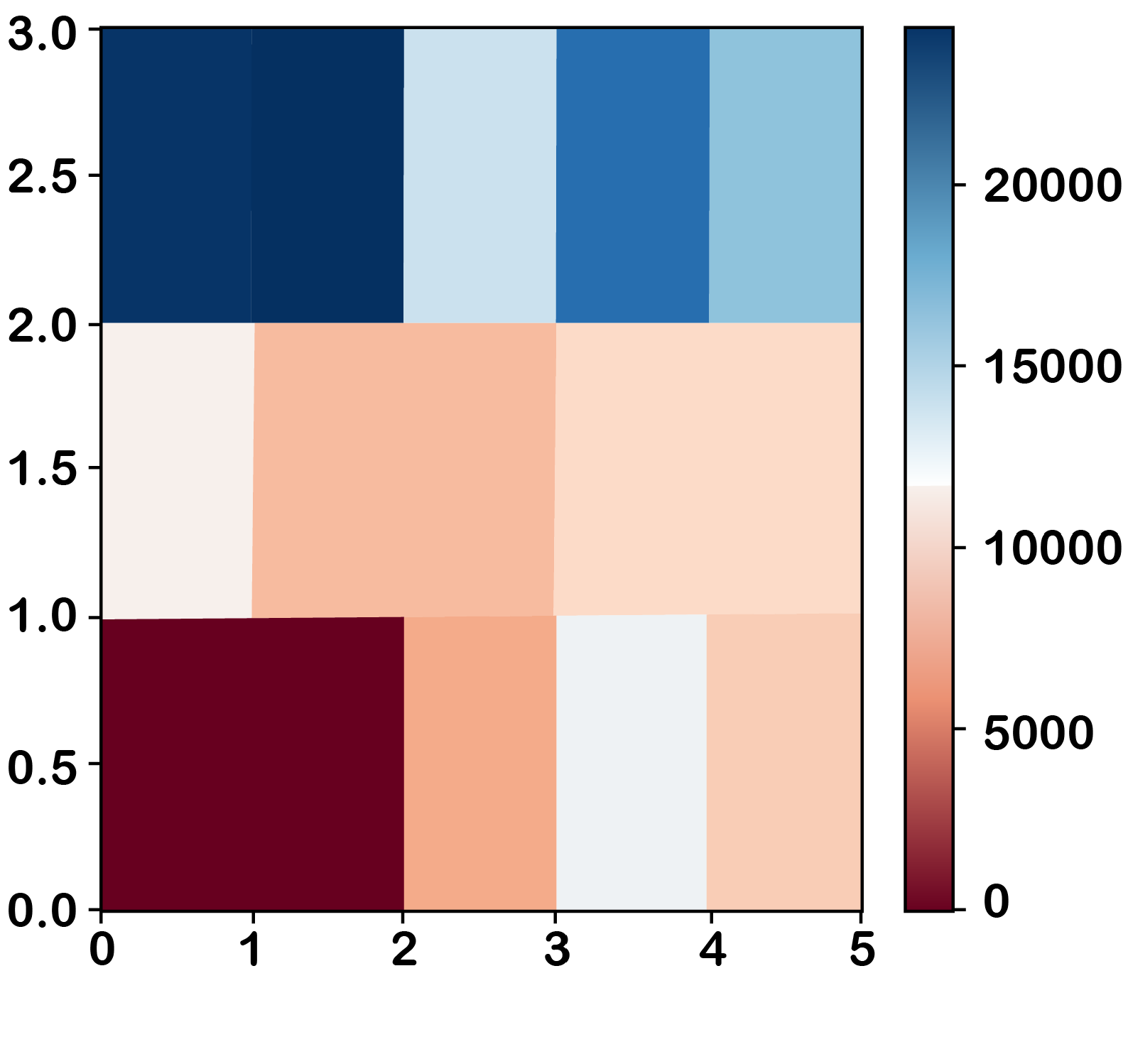
#select only the numerical columns from df
numerical_df = df.select_dtypes(include=[np.number])

# create a correlation matrix with numerical variables
correlation_matrix = numerical_df.corr()

# change the values which do not meet the filter criteria to NaN
high_correlation = correlation_matrix[(abs(correlation_matrix) > 0.7) & (correlation_matrix != 1)]

# drop all rows and columns which do not contain any filter criteria
filtered_correlation = high_correlation.dropna(how='all', axis=0).dropna(how='all', axis=1).round(2)
# you can also use "filtered-correlation.fillna('-', inplace=True)" to have a cleaner look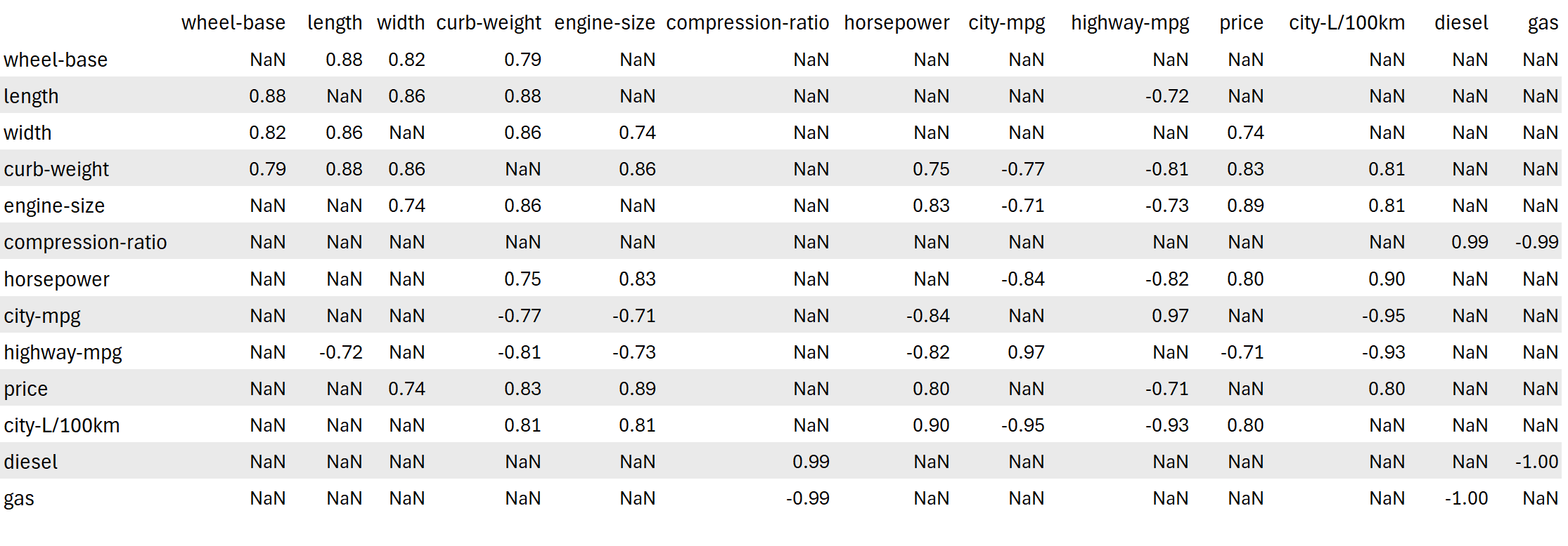
# correlation between engine-size and price
df[["engine-size", "price"]].corr()

# create a linear regression plot
import seaborn as sns
plt.title("Linear regression plot\nEngine size vs Price")
sns.regplot(x="engine-size", y="price", data=df)
plt.ylim(0,)
plt.show()

# Calculate linear regression
slope, intercept, r_value, p_value, std_err = stats.linregress(df['engine-size'], df['price'])
print(f"Slope: {slope}, Intercept: {intercept}, R-squared: {r_value**2}, P-value: {p_value}, Standard Error: {std_err}")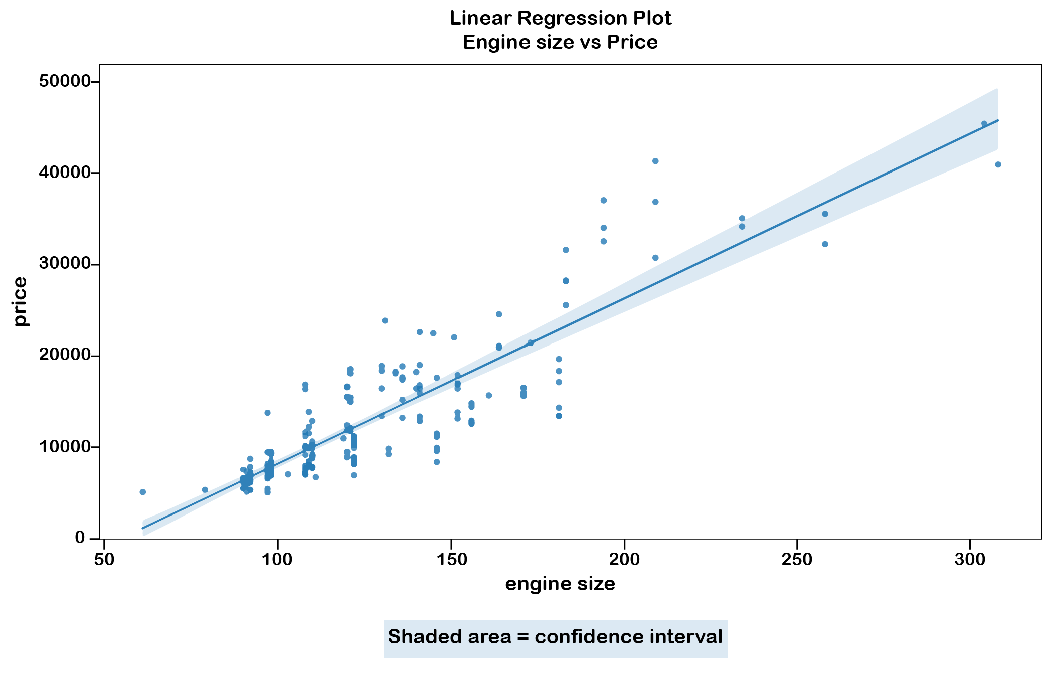
Slope: 166.86001569141598, Intercept: -7963.338906281046, R-squared: 0.7609686443622009, P-value: 9.265491622198355e-64, Standard Error: 6.629332440878305
-
Slope: how much y changes when x increases by one unit
Intercept: the predicted value of y when x is zero
R-squared: ranges from 0 to 1, with 1 indicating that the regression predictions perfectly fit the data.
P-value: a low p-value (< 0.05, typically) indicates that you can reject the null hypothesis (no effect or no difference) and consider the changes in x to statistically significantly impact y
Standard error: estimates the variability or uncertainty around this coefficient estimate if you were to conduct the same study multiple times. Smaller standard errors suggest more precise estimates. Larger samples generally lead to smaller standard errors.
# correlation between peak-rpm and price
df[["peak-rpm", "price"]].corr()

# create a linear regression plot
import seaborn as sns

plt.title("Linear regression plot\nPeak-rpm vs Price")
sns.regplot(x="peak-rpm", y="price", data=df)
plt.ylim(0,)
plt.show()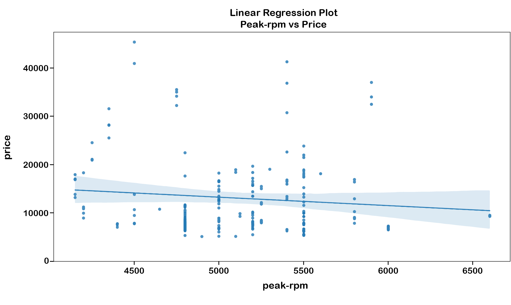
import numpy as np
import pandas as pd
import matplotlib.pyplot as plt
import seaborn as sns
from scipy import stats
url="https://cf-courses-data.s3.us.cloud-object-storage.appdomain.cloud/IBMDeveloperSkillsNetwork-DA0101EN-Coursera/laptop_pricing_dataset_mod2.csv"
df = pd.read_csv(url, header=0)
df.head()
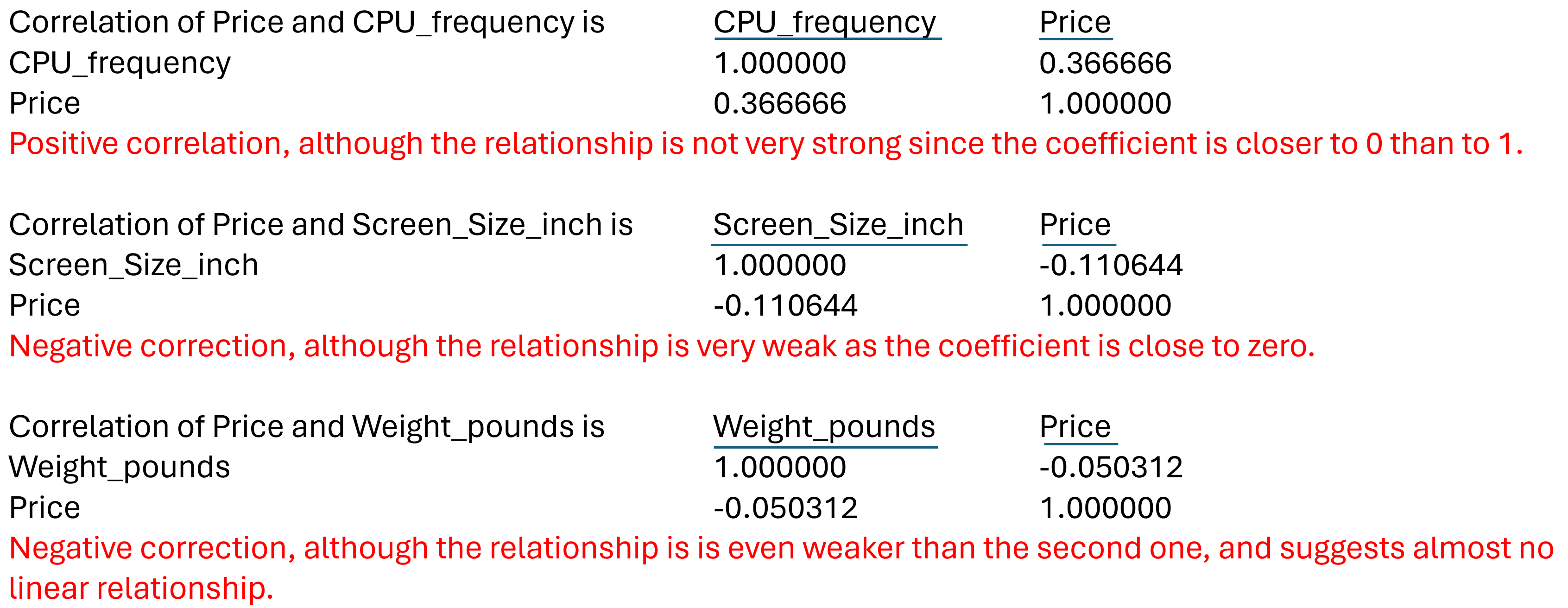
# Correlation values of CPU_frequency", "Screen_Size_inch" and "Weight_pounds" with Price
for param in ["CPU_frequency", "Screen_Size_inch","Weight_pounds"]:
print(f"Correlation of Price and {param} is ", df[[param,"Price"]].corr())